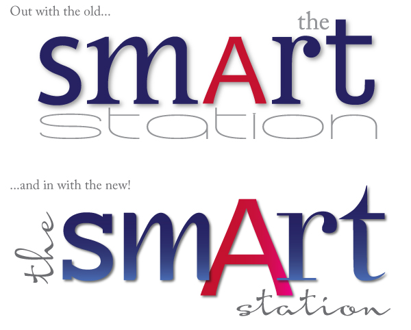
My first blog - and a new look!
Well, we all need a bit of a spruce up every now and then (some of us more than others!!) (yes, I mean me!) and what better way than an upgrade to my website and a revamp of my logo. Think of it like buying a new lippy or pair of shoes to lift the spirits!
If you’re reading this on a smartphone or tablet, hopefully you should be enjoying a better viewing experience, as my web guru Mike Teare of Abbeydale.net has worked his magic and made my website ‘responsive’, so it alters its layout and appearance to suit the shape and orientation of the screen it’s viewed on, so it’s much easier to read and view the images. And now I’ve got this blog too – no excuse for not sharing my thoughts more regularly!
So on to my new look. You’d think designing my own logo would have to be the easiest job of all, but I’ve discovered I am a terrible client – knowing that my old logo felt a bit tired (it was over 5 years old, to be fair), but not sure what I wanted to do with it to give it a fresher look.
I knew I wanted to keep the mismatch of fonts, as that helps to demonstrate the versatility that a good knowledge of fonts can bring, so that’s where I started. This gave me a fabulous excuse to research one of my favourite subjects (as many of you will know!) and rootle out some truly mouth-watering and luscious fonts and typefaces. The colour scheme got a bit of a lift too, still keeping to my recognised dark blue and cherry red, but adding gradients to give a tonal feel for interest.

I ended up with some gorgeous examples of different font styles from sans and slabs to classic serifs, ornamental, humanist and script. I’m really happy with it - I hope you like it too!
Gaynor x
1 October 2014


